
Strapi is an open-source, headless content management system (CMS) that allows developers to work with the tools and frameworks of their choice. In version 4, Strapi enhanced its design system and redesigned its user interface, which led to noteworthy improvements.
In this article, we will begin to comprehend how Strapi has improved its design system and how this can assist content managers and developers.
📑 What is a design system? 🔗
A design system is a collection of reusable components and guidelines that can be applied to design digital products and services. The idea that a design system is comprised solely of design elements is a widespread misunderstanding; however, it is essential to remember that it may also include code snippets, guidelines, and templates, amongst others. This system ensures that designs are consistent and can be easily replicated by using UI components and elements that have already been created.
A few examples of design systems include the Google Material Design System, the Apple Human Interface Guidelines, the Microsoft Fluent Design System, the Atlassian Design System, and the Shopify Design System, amongst others.
The idea that a design system is comprised solely of design elements is a widespread misunderstanding – it may also include code snippets, guidelines, and templates, amongst others
Overview of the Strapi design system 🔗
The Strapi design system is a collection of open-sourced design principles and components designed to ensure that the Strapi admin panel provides a consistent user experience.
Specifically, it includes design guidelines that can be implemented in any front-end component. Developers can simplify and speed up the process of developing user interfaces by utilizing a design system, a collection of assets that can be reused. The design system has a few components:
- 📐 Grids: The Strapi grid system makes it easier for content to proceed in a specific order and improves readability. 8px is the default font size; smaller adjustments and greater flexibility can be achieved using a 4px baseline when needed. When defining measurements, spacing, and element positioning in the spacing system, multiples of 4 px are used. A 12-column responsive grid with a fixed gutter width of 20px and a fixed margin of 56px is utilized to maintain consistency.
- 🖋️ Typography: This is another important element of the design system. Good typography presents content clearly and effectively. In terms of typeface, it uses the default system font associated with the operating system. MacOS, iOS, and iPadOS, for instance, use the San Francisco user interface; Windows uses the Segeo user interface; Android uses Roboto; and Linux Ubuntu uses the sans-serif font.
Components of the Strapi design system 🔗
Components are distinct, reusable building blocks for creating user interfaces (UIs) in digital products like websites and applications. 🧱 Components can be as simple as buttons and icons or as complex as navigation bars, modals, and cards.
There is a wide range of possible components that can be used. The reusability of components is its most important quality because it enables design and development processes to be designed and developed consistently and efficiently.
Types of components available on Strapi 🔗
There are a variety of components that can be found on Strapi, including the following:
- 🔘 Button: Within a page, actions can be carried out using buttons. With just one click, they make it possible to interact with the website's content. Through their design, particular labels, and icons, they assist in comprehending the most essential steps that should be considered. One of the interface's most frequently used button components is also known as the primary action. It can have a variety of meanings and variations.
In the official documentation, you will find the sizes and variations that are available.
- 📇 Card: The purpose of cards is to collect information that needs to be distinguished from the rest of the details on the page. One could have a card with or without an asset and an action.
Multiple props of a card are available here.
- 🏷️ Tooltip: Tooltips are labels that float and show extra information when an element is hovered over. Tooltips are a useful tool for displaying additional information about an element or the complete version of truncated text. The tooltip will overlay any text that is next to it. By adjusting the position parameter, you can modify the tooltip's location. The default position is at the top.
Check other tooltip props available in Strapi's documentation.
- ䷢ Table: Tables are utilized to collect and display comparable data. They are made up of a header, rows, and columns, respectively. A variety of data types can be incorporated into tables, including plain text, Select, avatars, and icon buttons, among others. In the content section, the columns can be reorganized, and they can also be sorted.
- ⌛ Progress Bar: The component known as the progress bar is utilized to determine how far along an action is at a particular point in time.
📲 How to integrate the Strapi design system in a React application 🔗
This section will cover building a React application and incorporating the Strapi design system into it.
To start, execute the following command to make a React application:
npx create-react-app react-design-system-appAfter creating the application, we will install the react-router-dom, styled-components, strapi design system, and strapi icons.
npm i react react-dom @strapi/design-system @strapi/icons react-router-domIt is crucial to remember that Strapi v4 does not yet support the current version of styled components, which is in version 6.
Therefore, you can install version 5 of the styled components or downgrade to version 5.
npm i styled-components@5
As seen in the snippets below, the next step is to wrap the App.js root provider within the index.js file with the DesignSystemProvider.
//index.js

import React from "react";
import ReactDOM from "react-dom/client";
import "./index.css";
import App from "./App";
import { DesignSystemProvider } from "@strapi/design-system";


const root = ReactDOM.createRoot(document.getElementById("root"));
root.render(
 <DesignSystemProvider>
   <React.StrictMode>
     <App />
   </React.StrictMode>
 </DesignSystemProvider>
);
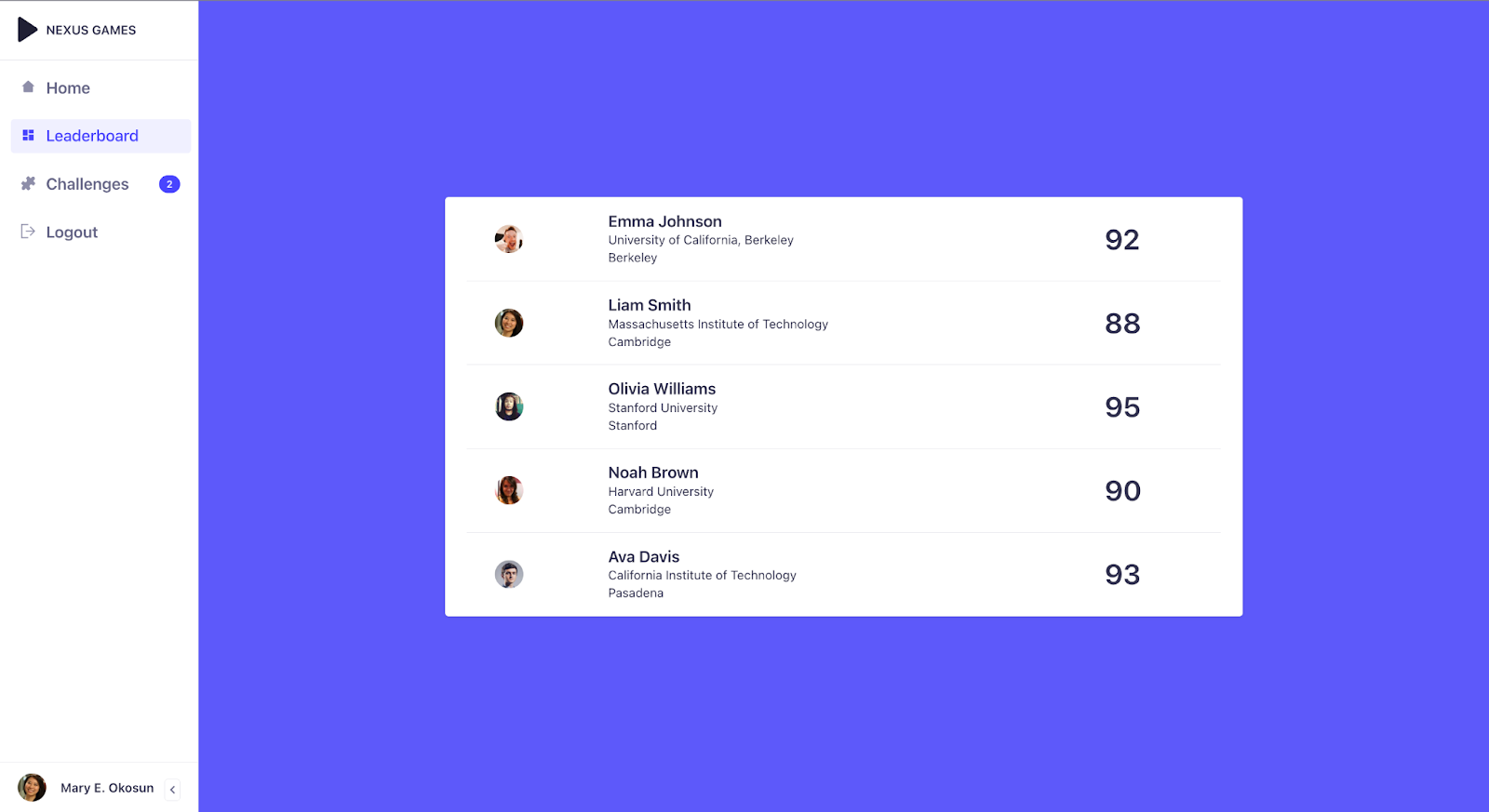
The App.js file will be modified to reflect the current changes to our application. We have a React application that functions as a leaderboard dashboard, where players can see their personal information (names, city, university, and profile picture), as well as the scores of other players.
//App.js

import { Box, Divider, Flex } from "@strapi/design-system";
import {
  MainNav,
  NavSections,
  NavCondense,
  NavBrand,
  NavUser,
  NavLink,
  NavFooter,
} from "@strapi/design-system/v2";
import { useState } from "react";
import { Play, Exit, House, Dashboard, Puzzle } from "@strapi/icons";
import {
  Table,
  Tbody,
  Tr,
  Avatar,
  Td,
  Typography,
} from "@strapi/design-system";
function App() {
  const [condensed, setCondensed] = useState(false);
  const ROW_COUNT = 6;
  const COL_COUNT = 10;
  const entries = [
    {
      firstName: "Emma",
      lastName: "Johnson",
      university: "University of California, Berkeley",
      score: 92,
      city: "Berkeley",
      cover: "https://randomuser.me/api/portraits/men/3.jpg",
    },
    {
      firstName: "Liam",
      lastName: "Smith",
      university: "Massachusetts Institute of Technology",
      score: 88,
      city: "Cambridge",
      cover: "https://randomuser.me/api/portraits/women/2.jpg",
    },
    {
      firstName: "Olivia",
      lastName: "Williams",
      university: "Stanford University",
      score: 95,
      city: "Stanford",
      cover: "https://randomuser.me/api/portraits/men/2.jpg",
    },
    {
      firstName: "Noah",
      lastName: "Brown",
      university: "Harvard University",
      score: 90,
      city: "Cambridge",
      cover: "https://randomuser.me/api/portraits/women/1.jpg",
    },
    {
      firstName: "Ava",
      lastName: "Davis",
      university: "California Institute of Technology",
      score: 93,
      city: "Pasadena",
      cover: "https://randomuser.me/api/portraits/men/1.jpg",
    },
  ];

  return (
    <Flex>
      <Box height="100vh">
        <MainNav condensed={condensed}>
          <NavBrand title="NEXUS GAMES" icon={<Play />} />

          <Divider />
          <NavSections>
            <NavLink icon={<House />}>
              <Typography variant="beta">Home</Typography>
            </NavLink>
            <NavLink icon={<Dashboard />} className="active">
              <Typography variant="beta">Leaderboard</Typography>
            </NavLink>
            <NavLink badgeContent="2" icon={<Puzzle />}>
              <Typography variant="beta">Challenges</Typography>
            </NavLink>
            <NavLink icon={<Exit />}>
              <Typography variant="beta">Logout</Typography>
            </NavLink>
          </NavSections>
          <NavFooter>
            <NavUser src="https://randomuser.me/api/portraits/women/2.jpg">
              <Typography fontWeight="bold">Mary E. Okosun</Typography>
            </NavUser>
            <NavCondense onClick={() => setCondensed((s) => !s)}>
              {condensed ? "Expanded the navbar" : "Collapse the navbar"}
            </NavCondense>
          </NavFooter>
        </MainNav>
      </Box>
      <Box width="900px" marginLeft="auto" marginRight="auto">
        <Table colCount={COL_COUNT} rowCount={ROW_COUNT} background="#202788d1">
          <Tbody>
            {entries.map((entry) => (
              <Tr key={entry.id}>
                <Td></Td>
                <Td>
                  <Avatar src={entry.cover} alt={entry.cover} />
                </Td>
                <Td>
                  <Typography variant="beta" fontWeight="bold">
                    {entry.firstName + " " + entry.lastName}
                  </Typography>
                  <br />
                  <Typography>{entry.university}</Typography>
                  <br />
                  <Typography textColor="neutral800">{entry.city}</Typography>
                </Td>

                <Td>
                  <Typography variant="alpha" fontWeight="bold">
                    {entry.score}
                  </Typography>
                </Td>
              </Tr>
            ))}
          </Tbody>
        </Table>
      </Box>
    </Flex>
  );
}

export default App;
Components such as <MainNav/>, <NavBrand/>, <NavSections/>, and <NavLink/> are utilized in the construction of the navigation section of the application. This section comprises the Home, Dashboard, Leaderboard, Challenges, and Logout tabs.
To construct the table, <Table/> components were utilized. These table components include sub-components like the <Tbody/>, <Td/>, and <Tr/>. This is where the contents are reflected, including the names, profile pictures, and other information about the players.
✔️ Conclusion 🔗
The Strapi design system is of utmost importance for individuals looking for design inspiration for their content and localization management requirements. It improves the consistency of your product and the overall user experience in various ways. It enables you to gain a better understanding of your project and make more informed choices.
With the help of the Localazy Strapi localization plugin, you can produce a multilingual website using Strapi. Check out our integration guide and documentation to enhance your multilingual content starting today.


